Repeater
Introduction
The Repeater component is a special component that is responsible for displaying an array of repeating components. For example, you have a hotel booking form in which the user must specify the number of guests and specify their full names. At the same time, the number of names entered changes dynamically, depending on the number of residents. The Repeater component is just made for such cases.
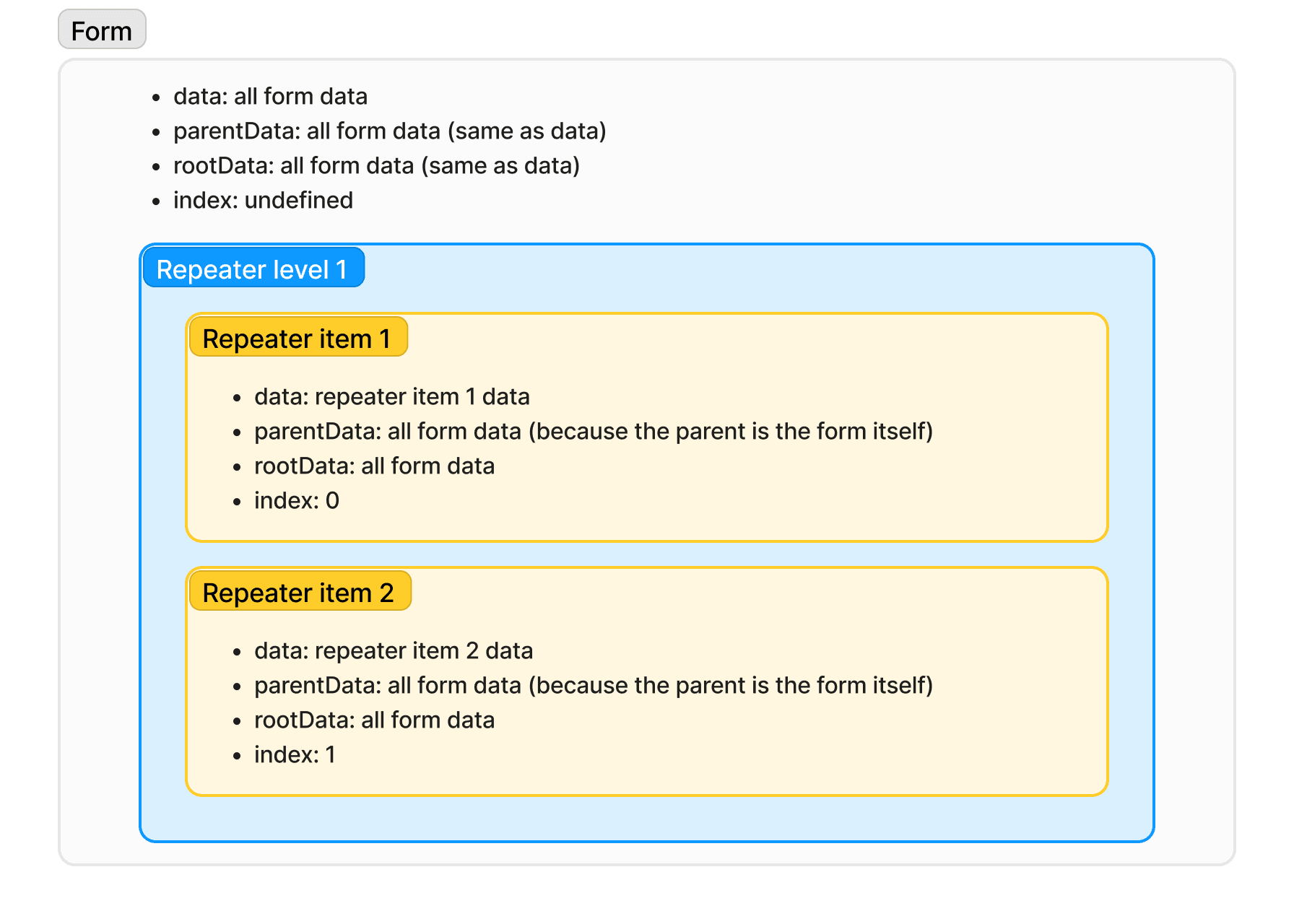
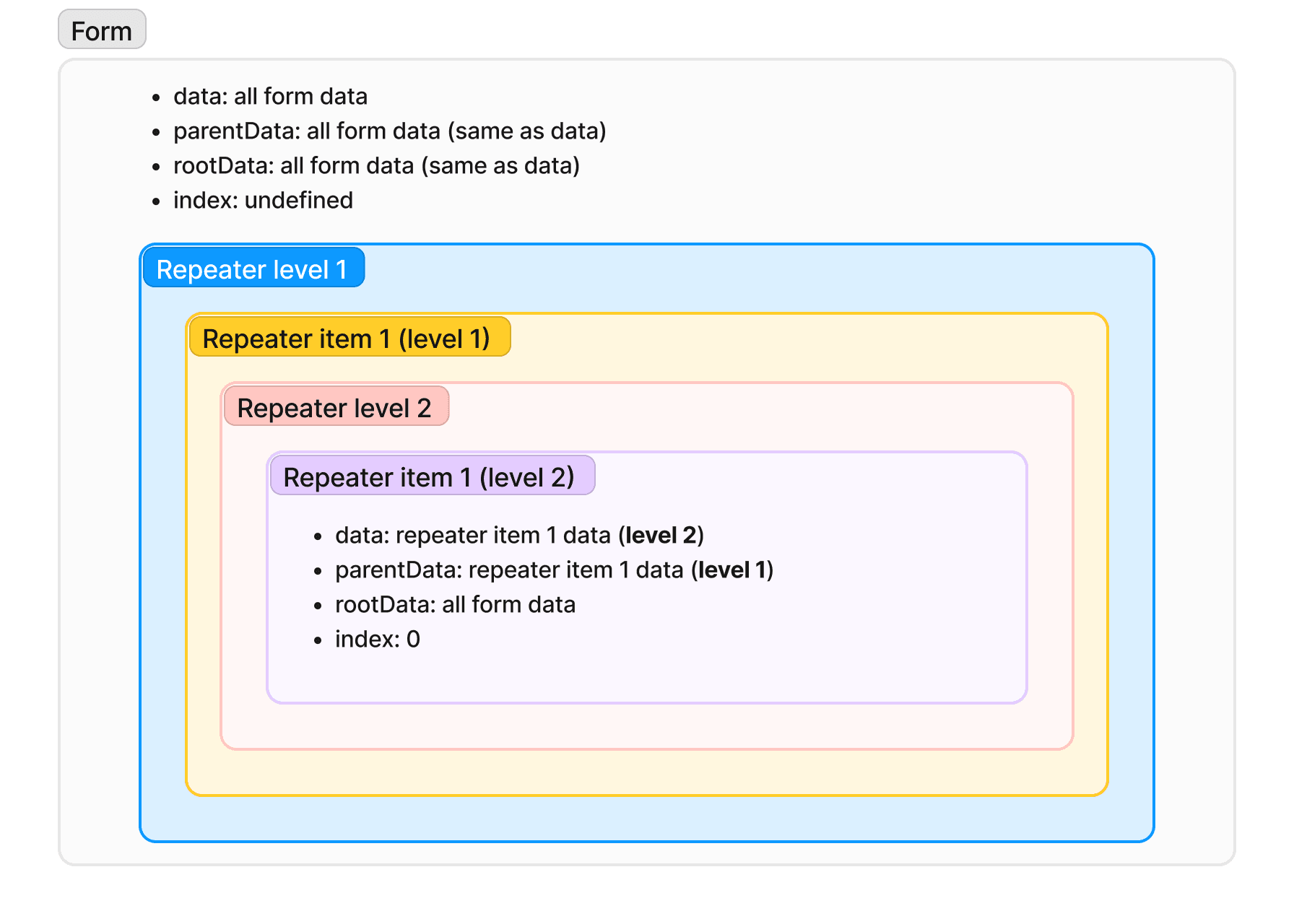
When you work with Repeater, the data available to you in actions and computed properties differs from the data in the usual form. In general, you have the following properties (see ActionEventArgs and IFormData):
data: data of the current form, for example, form data or repeater item data;parentData: parent form data, such as the data of the form's parent repeater item, or form data if the form is not in a repeater;rootData: the all form data;index: index of the current repeater item, if the component is inside the repeater;
Below is a picture explaining the data for the first level repeater:
For a level two repeater:
See this guide for more information on using the Repeater. To let users drag rows to a new order, use Sortable list.
How Value relates to form data
form.data/ fieldvalue: live array of row objects built from each row’s generated data (nested fields, templates, computed properties).- Length and order: driven by the field’s internal storage, updated when you call
setValue(includingaddRow,removeRow,e.data[key] = [...], and SortableList drag). - Viewer
initialData: hydrates the list and supports controlled hosts. Mutations do not write the array back into the props store on their own. If you pass controlledinitialData, sync full snapshots from onFormDataChange. See Working with form data.
Computed value expressions still follow the expression / data-change reaction. Non-computed lists use the storage updated by setValue.
Main properties
The following general properties are available within the Main tab:
| Name | Type | Description |
|---|---|---|
| Item Render When | string | Like Render When, but for one array index (via nested RepeaterItem): it controls whether that row’s content renders. The row context usually remains, the entry stays in the repeater’s row list. |
| Value | array | Data for the component, an array of objects. See How Value relates to form data. |
For drag reorder, Disabled, Read Only, and Item Render When behavior with empty handles, see
Sortable list.
At the bottom of the Main properties menu, you can find additional options:
- Render When: Provides conditional rendering for your component as described in the corresponding chapter.
- HTML attributes: Allows you to provide custom HTML attributes for your form.
Style properties
These are properties that allow you to customize the placement of components within the Repeater:
- Component > Direction: Defines how components are placed within a single Repeater element (e.g., column, row, etc.).
- Component > Item gap: Defines the gap between components within a single Repeater element.
- Wrapper > Direction: Defines how the elements of the Repeater are arranged (e.g., column, row, etc.).
- Wrapper > Item gap: Defines the gap between the Repeater elements.
- Wrapper > Class Name: Add a class name for your component for the subsequent styling if necessary.
For more information: