Getting Started with Custom Components
This guide will help you create your first custom component for FormEngine Core. We'll start with a simple alert component and gradually add more features.
A custom component in FormEngine Core is meta-information about a React component, which consists of: a React component, the component type, and a description of the component properties. Meta-information on component properties in FormEngine Core is called an annotation.
FormEngine Core has the following APIs for describing a component:
- define: is the primary method for defining a component.
- string: annotation builder for properties of type
string. - boolean: annotation builder for properties of type
boolean. - number: annotation builder for properties of type
number. - size: annotation builder for properties of type 'CSS unit'.
- date: annotation builder for properties of type
Date. - time: annotation builder for properties of type
Time. - array: annotation builder for properties of type
array. - color: annotation builder for properties of type
color. - className: annotation builder for properties containing the CSS class name.
- event: annotation builder for properties of type
event. - node: annotation builder for properties of type
ReactNode. - oneOf: annotation builder for properties of type
enum, the property value can only be one of enum. - someOf: annotation builder for properties of type
enum, the property value can contain multiple enum values. - readOnly: annotation builder for
booleanproperties that make a component read-only. - fn: annotation builder for
functionproperties. - There are other APIs for describing component properties, you can find them in the documentation, these APIs deal with describing synthetic properties of a component (e.g. a set of arbitrary HTML attributes).
Prerequisites
Before starting, ensure you have:
- A FormEngine Core project set up
- Basic knowledge of React and TypeScript
- Understanding of how forms work in FormEngine
Step 1: Setting Up Your Environment
1.1 Create a Component Directory
Create a folder named components/custom inside the src folder. The directory structure in this example will be as follows:
src/
├── components/
│   └── custom/
│       ├── FeMyAlert.test.tsx
│       ├── MyAlert.css
│       ├── MyAlert.test.tsx
│       ├── MyAlert.tsx
│       └── myAlertComponent.ts
├── views/
│   └── customView.ts
├── forms/
│   └── exampleForm.json
└── App.tsx
1.2 Install Required Dependencies
Make sure you have FormEngine Core installed:
npm install @react-form-builder/core
Step 2: Creating Your First Component
Let's create a simple alert component that displays a message.
2.1 Create the React Component
Create a file src/components/custom/MyAlert.tsx:
import React from 'react'

// Step 1: Create a regular React component
interface MyAlertProps {
  /** The message to display */
  message: string;

  /** The type of alert (success, warning, error) */
  type?: 'success' | 'warning' | 'error';

  /** Whether the alert is dismissible */
  dismissible?: boolean;
}

export const MyAlert: React.FC<MyAlertProps> = ({
                                                  message,
                                                  type = 'success',
                                                  dismissible = false
                                                }) => {
  const [isVisible, setIsVisible] = React.useState(true)

  if (!isVisible) return null

  return (
    <div
      className={`alert alert--${type}`}
      role="alert"
    >
      <span className="alert__message">{message}</span>
      {dismissible && (
        <button
          className="alert__close"
          onClick={() => setIsVisible(false)}
          aria-label="Close alert"
        >
          ×
        </button>
      )}
    </div>
  )
}
2.2 Wrap with FormEngine's define()
Now wrap your component to make it available in FormEngine. Create a file src/components/custom/myAlertComponent.ts:
import {boolean, define, oneOf, string} from '@react-form-builder/core'
import {MyAlert} from './MyAlert.tsx'

// Step 2: Define the component for FormEngine
export const myAlertComponent = define(MyAlert, 'MyAlert')
  .props({
    // The message prop - required string
    message: string.default('This is an alert'),

    // The type prop - enum with default
    type: oneOf('success', 'warning', 'error').default('success'),

    // The dismissible prop - boolean
    dismissible: boolean.default(false)
  })
  .build()
Of course, you can do everything in one file. In this tutorial, the separation is done for ease of understanding.
Step 3: Adding to Your View
3.1 Create or Update Your View
In src/views/customView.ts:
import {view as muiView} from '@react-form-builder/components-material-ui'
import {myAlertComponent} from '../components/custom/myAlertComponent.ts'

// Create a custom view that includes Material UI components + custom components
export const customView = muiView

// Adds the myAlertComponent component
// The model property is meta-information about the component for FormEngine Core
customView.define(myAlertComponent.model)
Step 4: Using in a Form
4.1 Create a Form JSON
Create src/forms/exampleForm.json:
{
  "form": {
    "key": "Screen",
    "type": "Screen",
    "children": [
      {
        "key": "welcomeAlert",
        "type": "MyAlert",
        "props": {
          "message": {
            "value": "Welcome to our form! Please fill in all required fields."
          },
          "type": {
            "value": "success"
          },
          "dismissible": {
            "value": true
          }
        }
      },
      {
        "key": "firstName",
        "type": "MuiTextField",
        "props": {
          "label": {
            "value": "First Name"
          }
        }
      },
      {
        "key": "warningAlert",
        "type": "MyAlert",
        "props": {
          "message": {
            "value": "This is a warning alert that cannot be dismissed."
          },
          "type": {
            "value": "warning"
          },
          "dismissible": {
            "value": false
          }
        }
      }
    ]
  }
}
4.2 Render the Form
In your React app:
import {FormViewer} from '@react-form-builder/core'
import React from 'react'
import formJson from './forms/exampleForm.json'
import {customView} from './views/customView'

const App: React.FC = () => {
  return (
    <div className="app">
      <h1>My Custom Component Demo</h1>
      <FormViewer
        view={customView}
        getForm={() => JSON.stringify(formJson)}
      />
    </div>
  )
}

export default App
Step 5: Adding Some Style
Create src/components/custom/MyAlert.css:
.alert {
  padding: 16px;
  margin: 16px 0;
  border-radius: 4px;
  display: flex;
  align-items: center;
  justify-content: space-between;
}

.alert--success {
  background-color: #d4edda;
  border: 1px solid #c3e6cb;
  color: #155724;
}

.alert--warning {
  background-color: #fff3cd;
  border: 1px solid #ffeaa7;
  color: #856404;
}

.alert--error {
  background-color: #f8d7da;
  border: 1px solid #f5c6cb;
  color: #721c24;
}

.alert__message {
  flex: 1;
  margin-right: 16px;
}

.alert__close {
  background: none;
  border: none;
  font-size: 24px;
  cursor: pointer;
  padding: 0;
  width: 32px;
  height: 32px;
  display: flex;
  align-items: center;
  justify-content: center;
}

.alert__close:hover {
  opacity: 0.7;
}
Update MyAlert.tsx to import the CSS:
import './MyAlert.css'
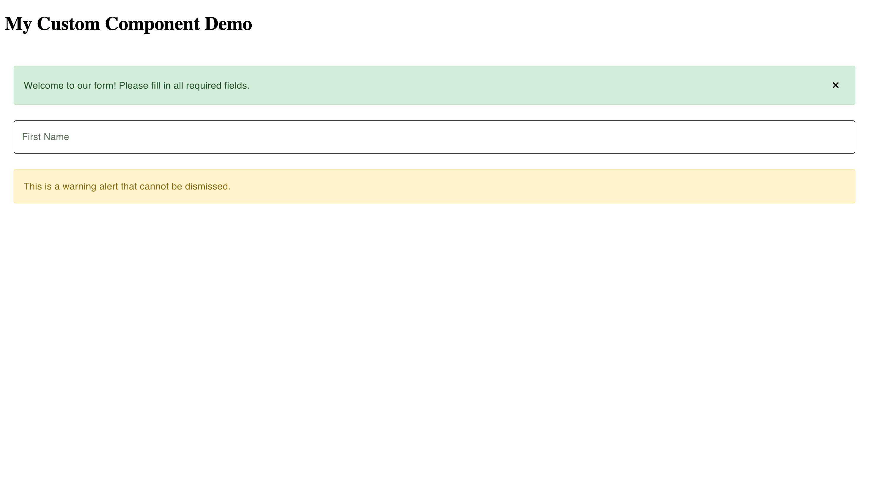
After making all the changes, you will see a page that looks something like this:
Step 6: Testing Your Component
6.1 Create a Test
Create src/components/custom/MyAlert.test.tsx:
import {cleanup, fireEvent, render, waitFor} from '@testing-library/react'
import {afterEach, describe, expect, test} from 'vitest'
import {MyAlert} from './MyAlert'
import '@testing-library/jest-dom/vitest'

describe('MyAlert', () => {
  afterEach(() => {
    cleanup()
  })

  test('renders message correctly', () => {
    const {getByText} = render(<MyAlert message="Test message"/>)
    expect(getByText('Test message')).toBeInTheDocument()
  })

  test('applies correct type class', () => {
    const {container} = render(<MyAlert message="Test" type="error"/>)
    const alert = container.querySelector('.alert')
    expect(alert).toHaveClass('alert--error')
  })

  test('shows close button when dismissible', () => {
    const {getByLabelText} = render(<MyAlert message="Test" dismissible={true}/>)
    expect(getByLabelText('Close alert')).toBeInTheDocument()
  })

  test('hides alert when close button is clicked', async () => {
    const {getByLabelText, queryByText} = render(<MyAlert message="Test" dismissible={true}/>)
    const closeButton = getByLabelText('Close alert')
    fireEvent.click(closeButton)
    await waitFor(() => expect(queryByText('Test')).not.toBeInTheDocument())
  })
})
6.2 Test with FormEngine
Create an integration test in src/components/custom/FeMyAlert.test.tsx:
import {FormViewer} from '@react-form-builder/core'
import {render} from '@testing-library/react'
import {expect, test} from 'vitest'
import {customView} from '../../views/customView.ts'
import '@testing-library/jest-dom/vitest'

test('MyAlert works within FormViewer', () => {
  const formJson = {
    form: {
      key: 'Screen',
      type: 'Screen',
      children: [
        {
          key: 'testAlert',
          type: 'MyAlert',
          props: {
            message: {value: 'Test alert message'},
            type: {value: 'success'}
          }
        }
      ]
    },
  }

  const {getByText} = render(
    <FormViewer
      view={customView}
      getForm={() => JSON.stringify(formJson)}
    />
  )

  expect(getByText('Test alert message')).toBeInTheDocument()
})
Live example
function App() {
  const MyAlert = ({
                     message,
                     type = 'success',
                     dismissible = false
                   }) => {
    const [isVisible, setIsVisible] = useState(true)

    if (!isVisible) return null

    return (
      <div
        className={`alert alert--${type}`}
        role="alert"
      >
        <span className="alert__message">{message}</span>
        {dismissible && (
          <button
            className="alert__close"
            onClick={() => setIsVisible(false)}
            aria-label="Close alert"
          >
            ×
          </button>
        )}
      </div>
    )
  }

  const myAlertComponent = define(MyAlert, 'MyAlert')
    .props({
      // The message prop - required string
      message: string.default('This is an alert'),

      // The type prop - enum with default
      type: oneOf('success', 'warning', 'error').default('success'),

      // The dismissible prop - boolean
      dismissible: boolean.default(false)
    })
    .build()

  // Create a custom view that includes Material UI components + custom components
  const customView = muiView

  // Adds the myAlertComponent component
  // The model property is meta-information about the component for FormEngine Core
  customView.define(myAlertComponent.model)

  const form = {
    "form": {
      "key": "Screen",
      "type": "Screen",
      "children": [
        {
          "key": "welcomeAlert",
          "type": "MyAlert",
          "props": {
            "message": {
              "value": "Welcome to our form! Please fill in all required fields."
            },
            "type": {
              "value": "success"
            },
            "dismissible": {
              "value": true
            }
          }
        },
        {
          "key": "firstName",
          "type": "MuiTextField",
          "props": {
            "label": {
              "value": "First Name"
            }
          }
        },
        {
          "key": "warningAlert",
          "type": "MyAlert",
          "props": {
            "message": {
              "value": "This is a warning alert that cannot be dismissed."
            },
            "type": {
              "value": "warning"
            },
            "dismissible": {
              "value": false
            }
          }
        }
      ]
    }
  }

  const getForm = useCallback(() => JSON.stringify(form), [form])

  return <FormViewer
    view={customView}
    getForm={getForm}
  />
}
Summary
Congratulations! You've created your first custom component. Let's recap what we learned:
- Create a React Component - Write a standard React component with props
- Wrap with define() - Use FormEngine's
define()function to register it - Add Properties - Define component properties using type builders (string, boolean, oneOf, etc.)
- Add to View - Include your component in a view configuration
- Use in JSON - Reference it in form JSON using the type name
- Style it - Add CSS for visual appeal
- Test it - Write unit and integration tests
Next Steps
Now that you understand the basics, you can explore more advanced topics:
- Simple Components - Learn about different property types and static components
- Valued Components - Add data binding to make interactive form fields
- Components with Events - Handle user interactions and trigger actions
Common Pitfalls
❌ Forgetting to Add to View
// Wrong: Component not in view
customView = createView([
  // MyAlert is missing!
])

// Right: Include all components
customView = createView([
  ...otherComponents,
  myAlertComponent.model,
])

// Or with the existing view
view.define(myAlertComponent.model)
❌ Mismatched Type Names
// Component definition
export const myAlert = define(MyAlert, 'MyAlert'); // Type name is 'MyAlert'
// Form JSON
{
  // Wrong: case-sensitive!
  "type": "Myalert"
}
// Should be:
{
  // Correct: matches exactly
  "type": "MyAlert"
}
Tips for Success
- ✅ Start Simple - Begin with display-only components before adding data binding
- ✅ Test Incrementally - Test each feature as you add it
- ✅ Use Descriptive Names - Clear component and property names help everyone
- ✅ Document Your Components - Add JSDoc comments for properties
- ✅ Follow Patterns - Look at built-in components for best practices
Happy component building! 🎉