Modal components
A modal component is a component that can display information in a modal window/dialog box on top of a form. Most popular component libraries support such components. You can find such a component in the @react-form-builder/components-rsuite component library.
Creating a modal form
We assume that you have the Designer and @react-form-builder/components-rsuite package installed.
First, we will need a form that will be displayed inside the dialog window. Let's call this form modal. This will be a form with two input
fields and two buttons.
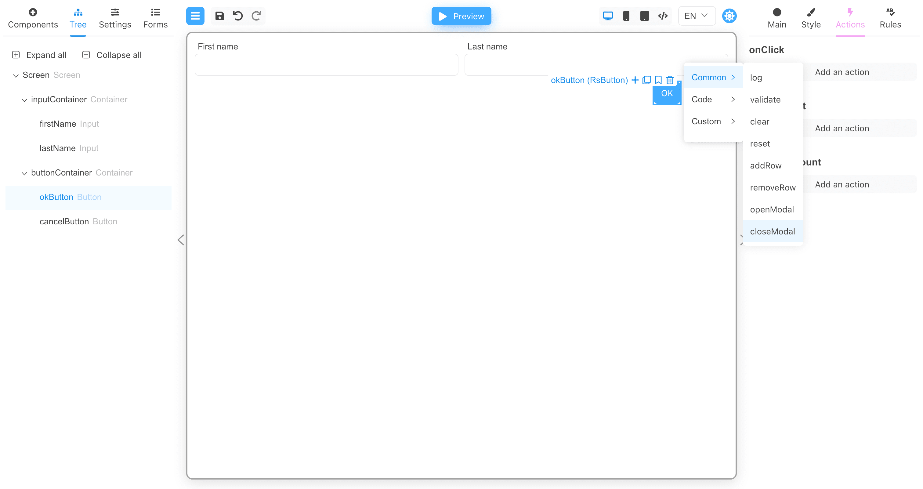
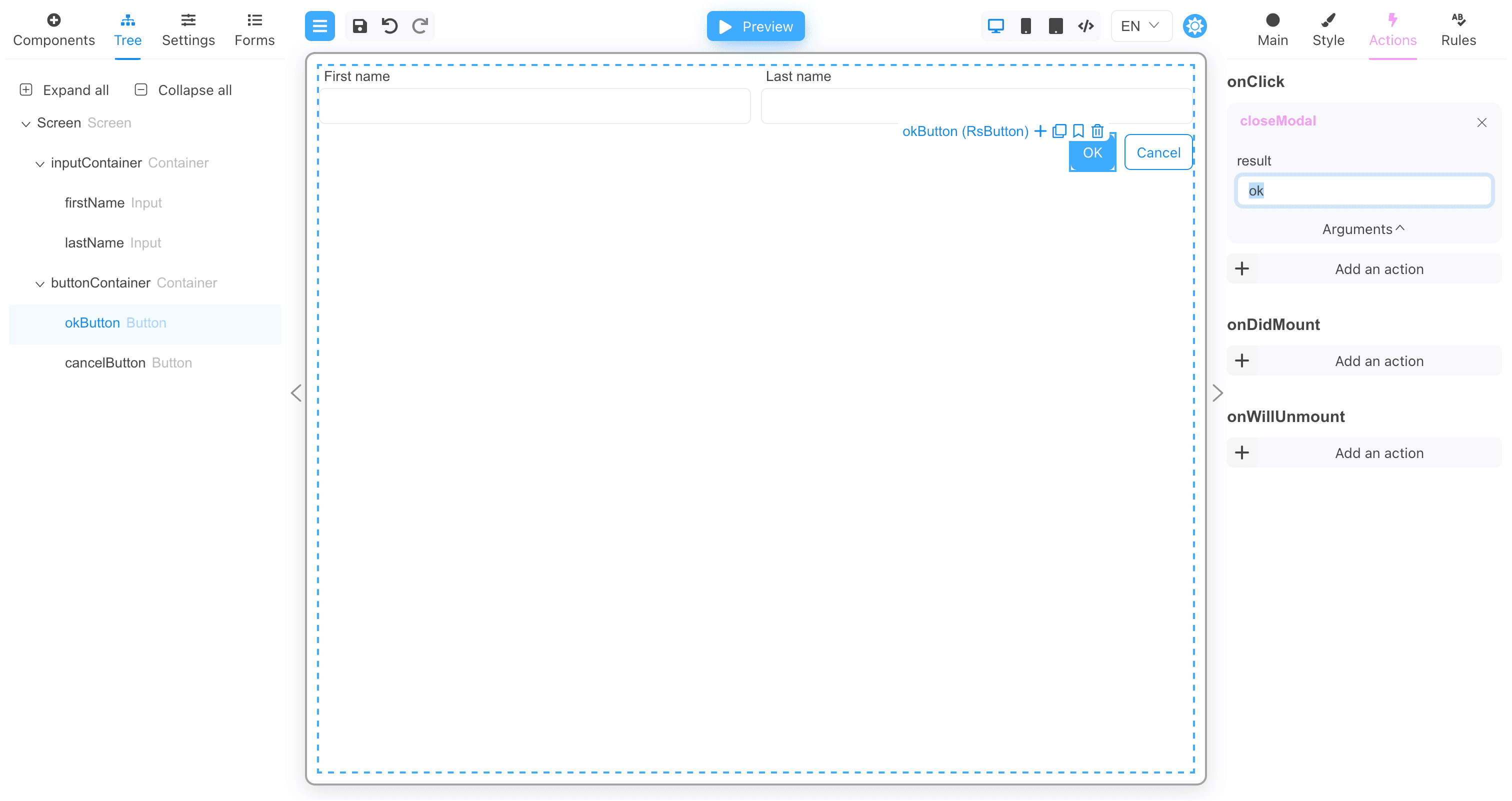
For the onClick event of the OK button, add a call to the closeModal action with the ok argument as the result of calling the modal
window.
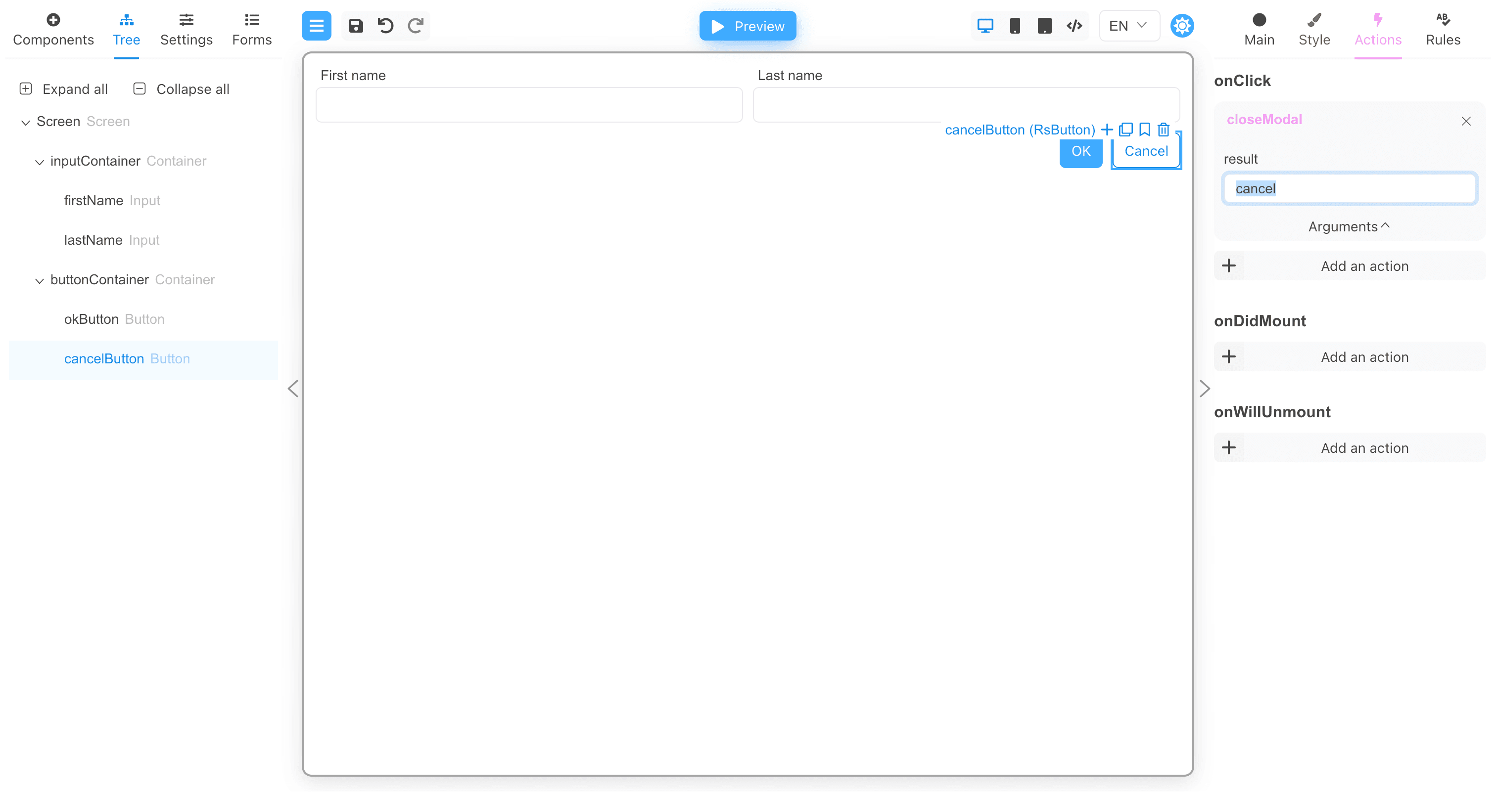
For the onClick event of the Cancel button, add a closeModal action call with the cancel argument as the result of calling the modal
window.
Modal's form JSON
{
  "version": "1",
  "form": {
    "key": "Screen",
    "type": "Screen",
    "props": {},
    "children": [
      {
        "key": "inputContainer",
        "type": "RsContainer",
        "props": {},
        "css": {
          "any": {
            "object": {
              "flexDirection": "row"
            }
          }
        },
        "children": [
          {
            "key": "firstName",
            "type": "RsInput",
            "props": {
              "label": {
                "value": "First name"
              }
            }
          },
          {
            "key": "lastName",
            "type": "RsInput",
            "props": {
              "label": {
                "value": "Last name"
              }
            }
          }
        ]
      },
      {
        "key": "buttonContainer",
        "type": "RsContainer",
        "props": {},
        "css": {
          "any": {
            "object": {
              "flexDirection": "row",
              "justifyContent": "end"
            }
          }
        },
        "children": [
          {
            "key": "okButton",
            "type": "RsButton",
            "props": {
              "children": {
                "value": "OK"
              },
              "appearance": {
                "value": "primary"
              }
            },
            "wrapperCss": {
              "any": {
                "object": {
                  "width": "fit-content"
                }
              }
            },
            "events": {
              "onClick": [
                {
                  "name": "closeModal",
                  "type": "common",
                  "args": {
                    "result": "ok"
                  }
                }
              ]
            }
          },
          {
            "key": "cancelButton",
            "type": "RsButton",
            "props": {
              "children": {
                "value": "Cancel"
              },
              "appearance": {
                "value": "ghost"
              }
            },
            "wrapperCss": {
              "any": {
                "object": {
                  "width": "fit-content"
                }
              }
            },
            "events": {
              "onClick": [
                {
                  "name": "closeModal",
                  "type": "common",
                  "args": {
                    "result": "cancel"
                  }
                }
              ]
            }
          }
        ]
      }
    ]
  },
  "localization": {},
  "languages": [
    {
      "code": "en",
      "dialect": "US",
      "name": "English",
      "description": "American English",
      "bidi": "ltr"
    }
  ],
  "defaultLanguage": "en-US"
}
Working with modal components
Now create a new form that will open the modal window.
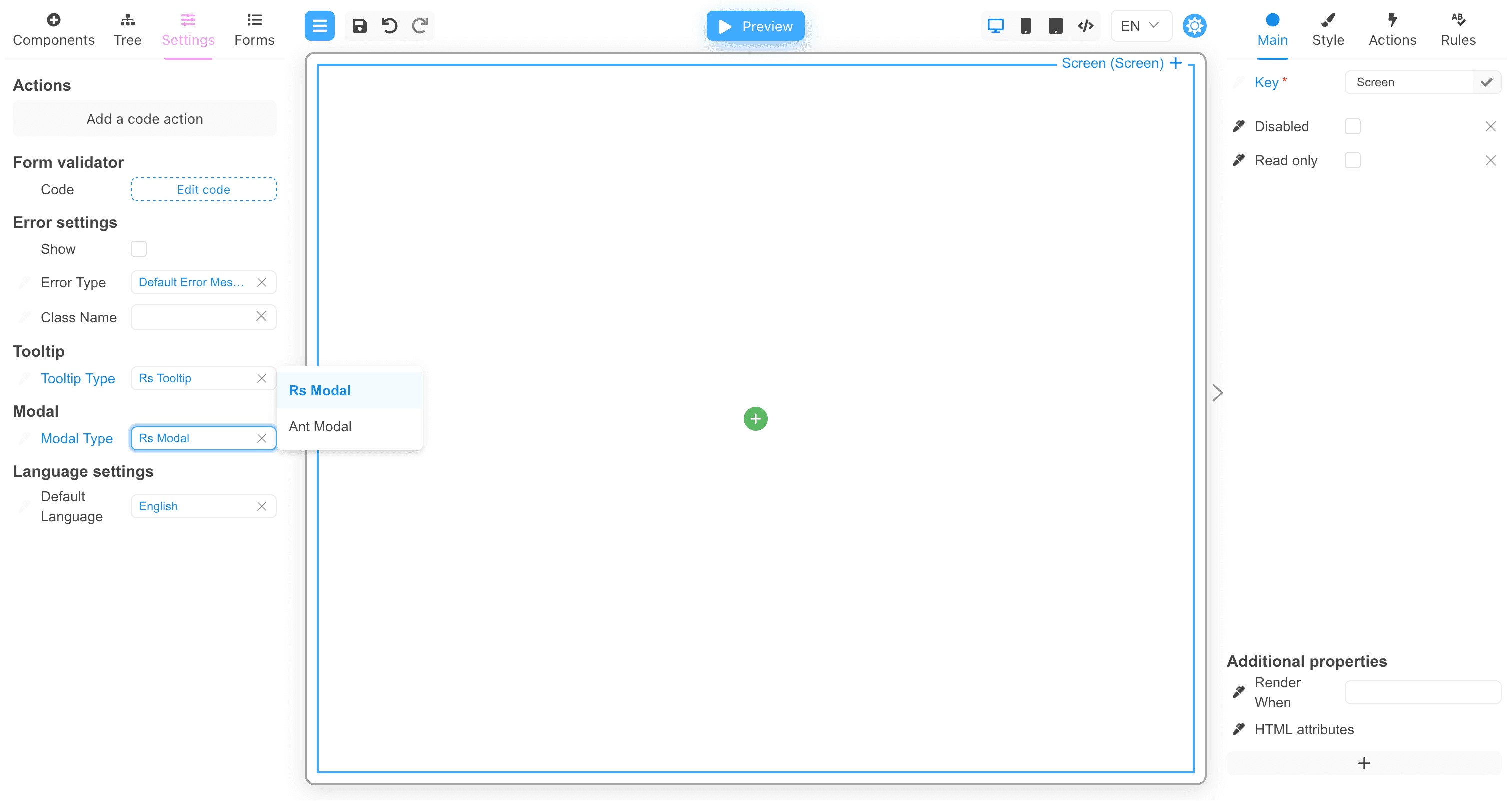
As with tooltips, you need to specify the component that will display the modal windows in the form settings.
Then you need to add the Modal component to the form.
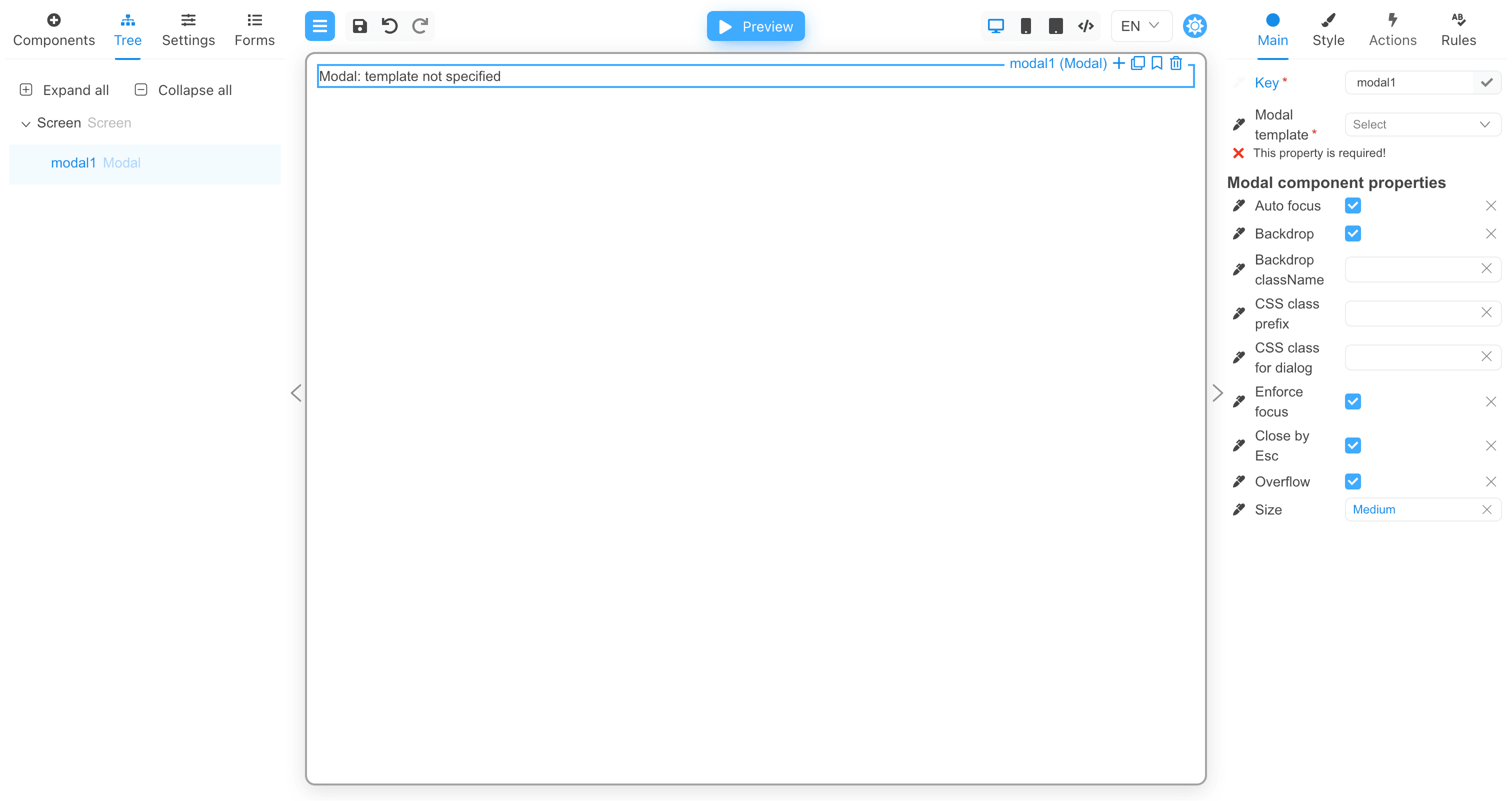
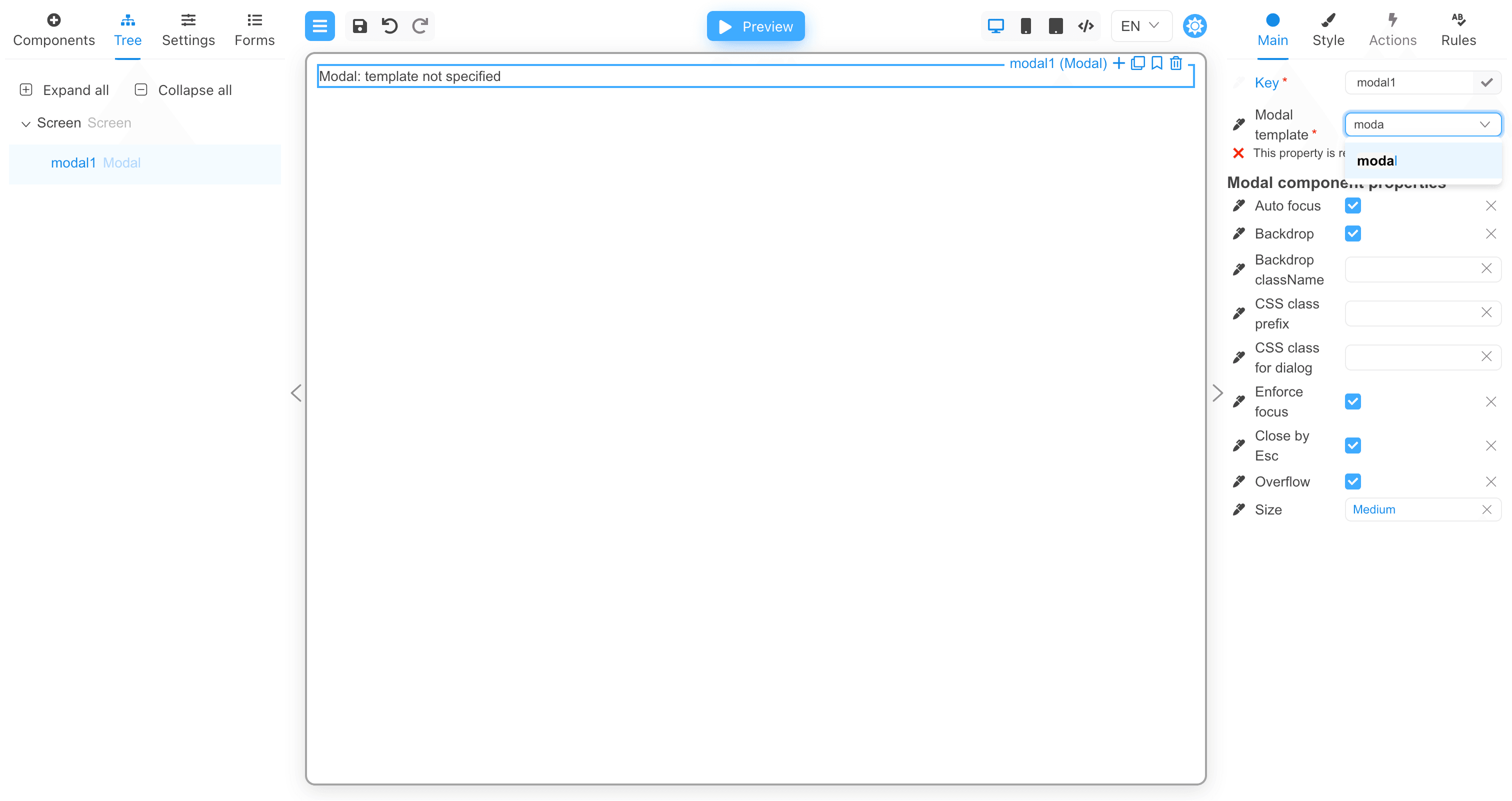
Now set the value in the Modal template property. This is the name of the form that will be displayed in the modal window.
Let's add a button and bind an action to the onClick event that will open the modal window.
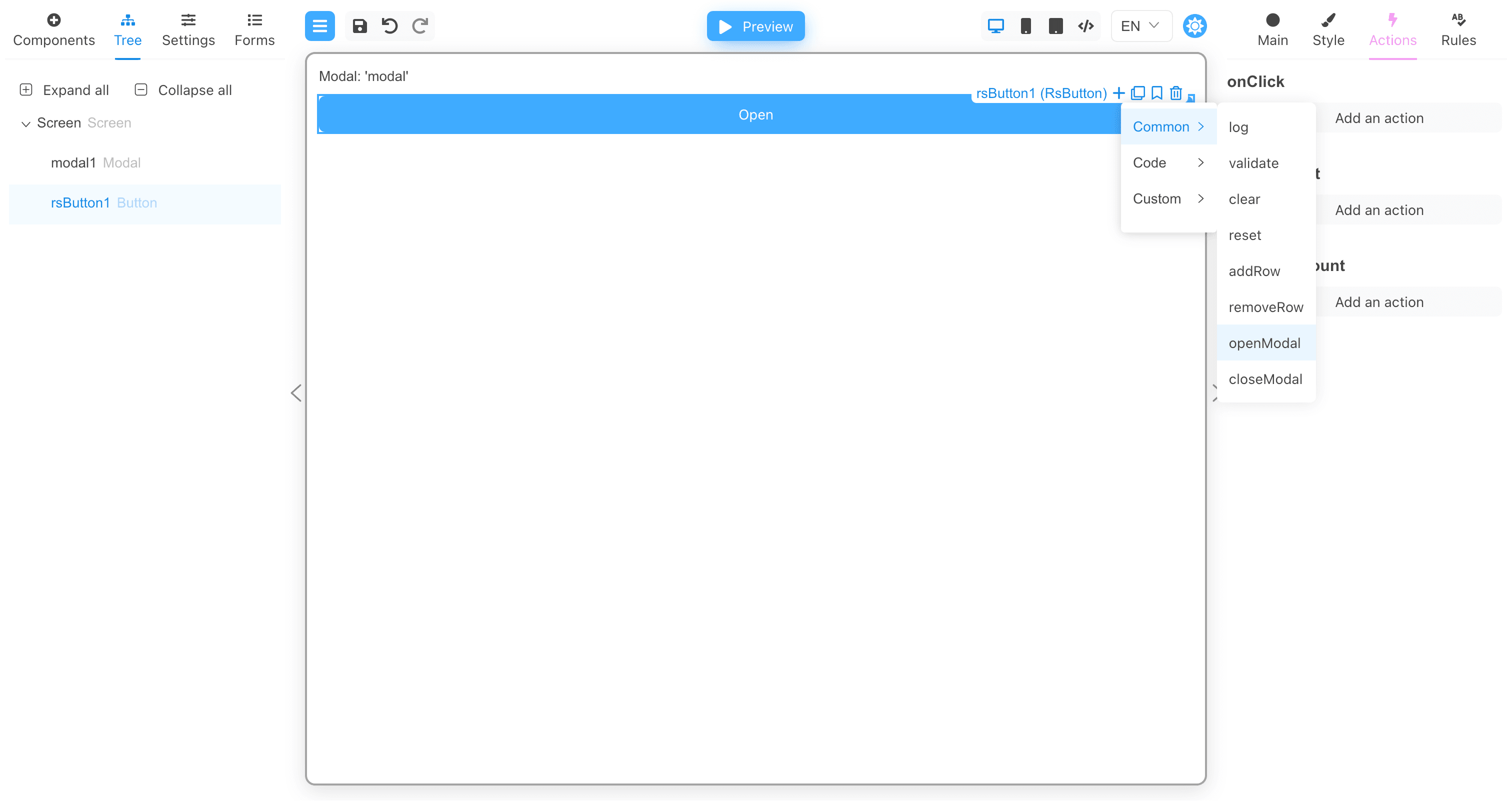
Then assign the modalKey argument the value modal1. This will link the openModal action to the modal1 component. When the
openModal action is performed, it will find the modal component in the form settings (RS Modal in our case), and then display this
modal component inside the component with the modalKey argument.
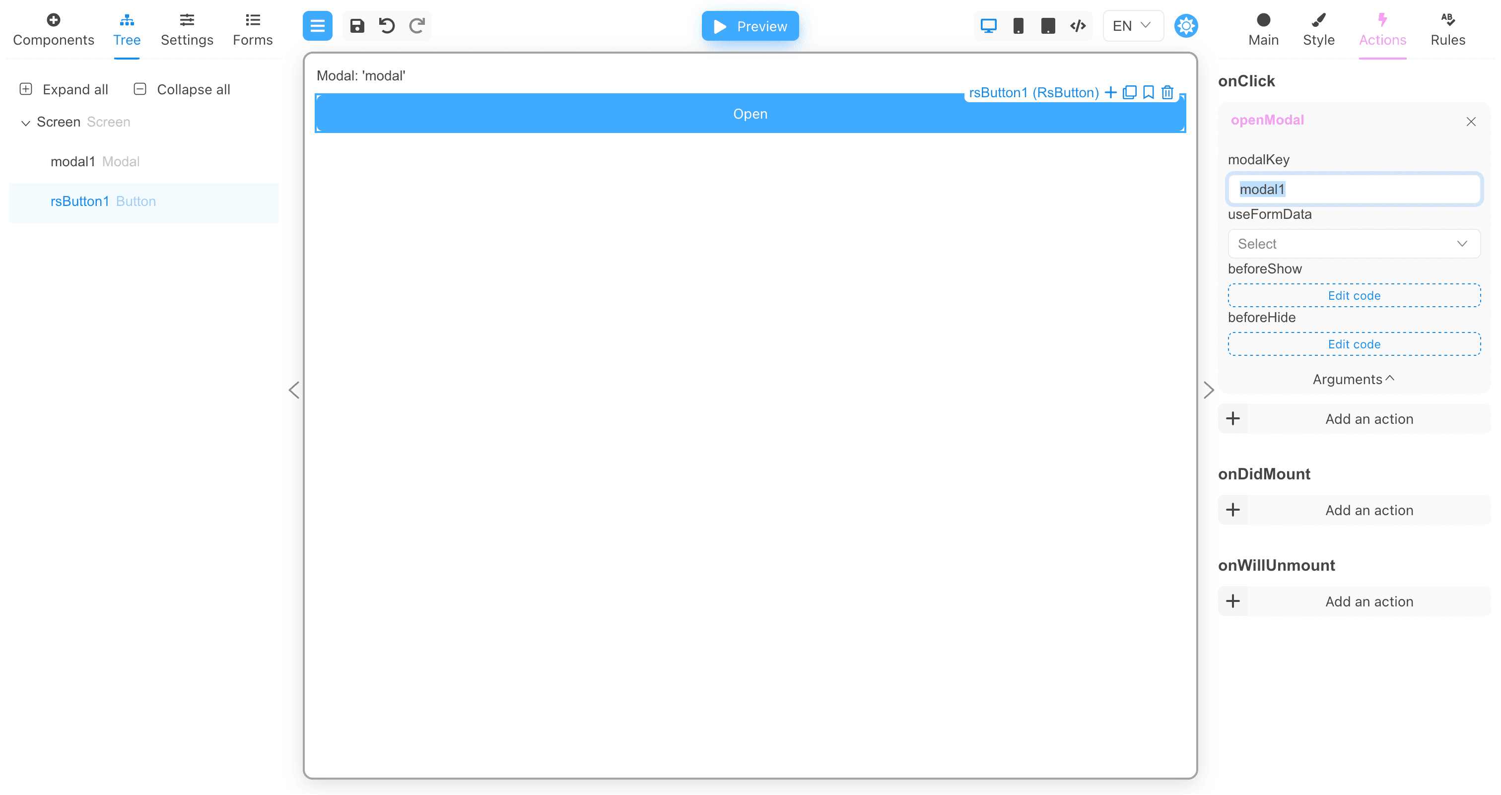
You can also set the useFormData argument to true if you want to transfer all form data to the modal window.
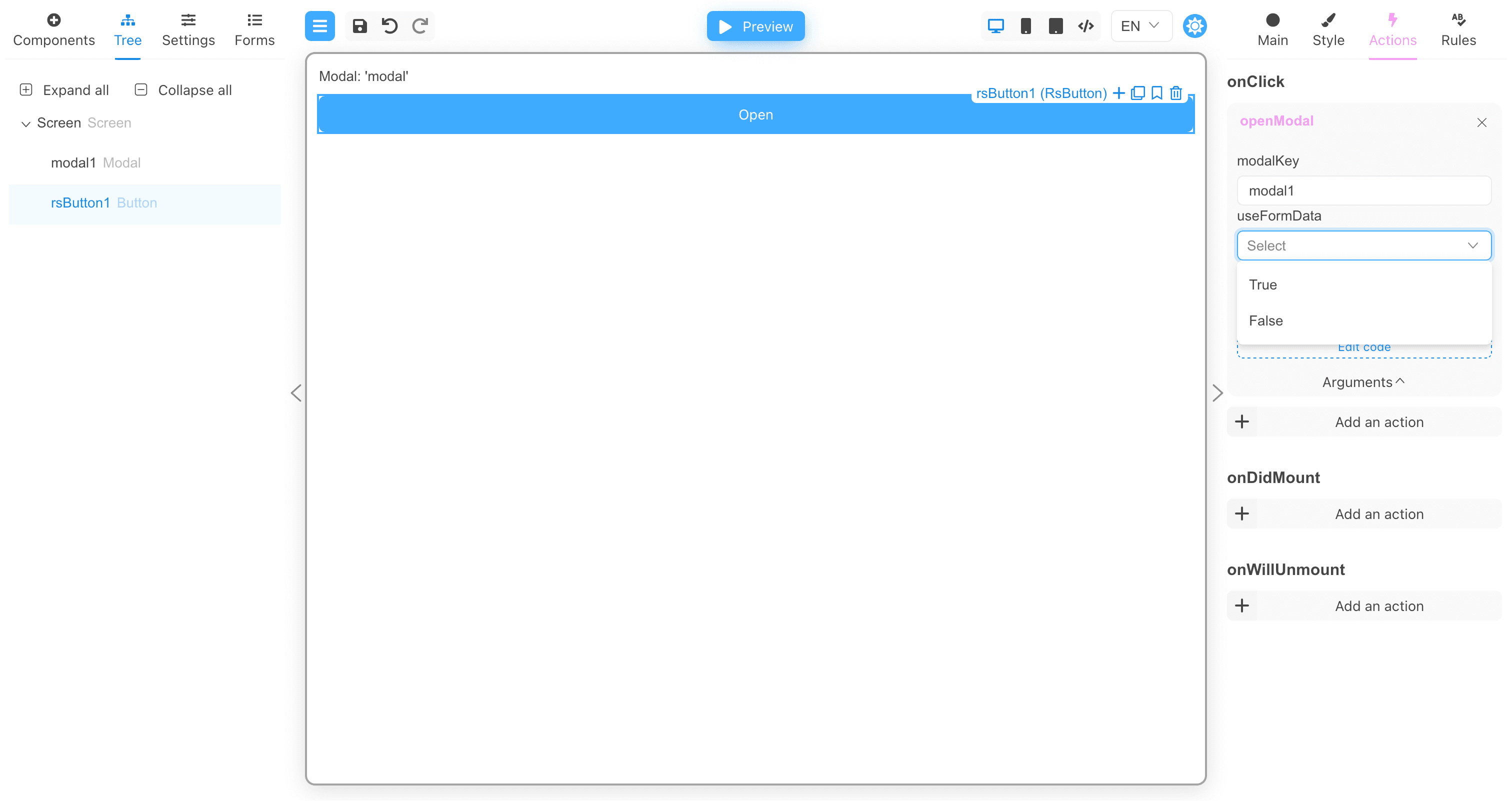
There are two more arguments: beforeShow and beforeHide. These arguments are functions.
The beforeShow function will be called before the modal window is displayed. If the beforeShow function returns false, the modal window
will not be displayed. If the function returns an object with data, this data will be passed to the modal window if the useFormData
argument is not true.
The beforeHide function is called before closing the modal window and can return data for the form from the modal window. If the function
returns an object with data, this data will be set in the form.
Transferring data to a modal form
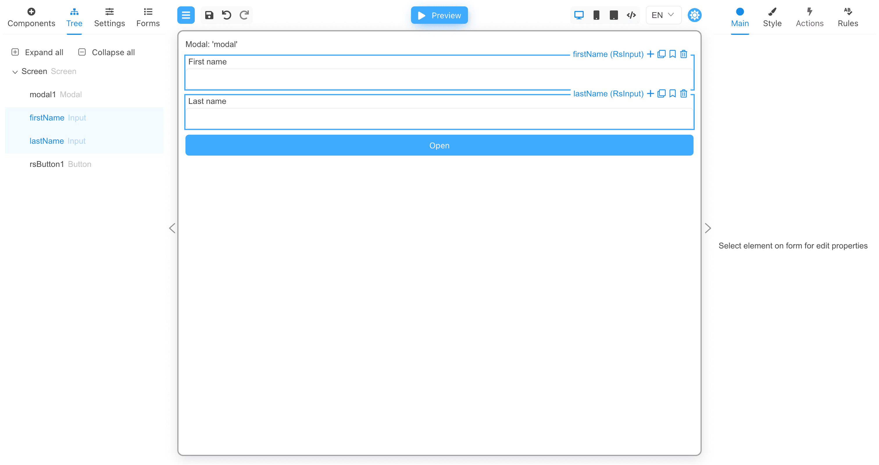
Let's add a few more fields to the form and pass the field values to the modal window.
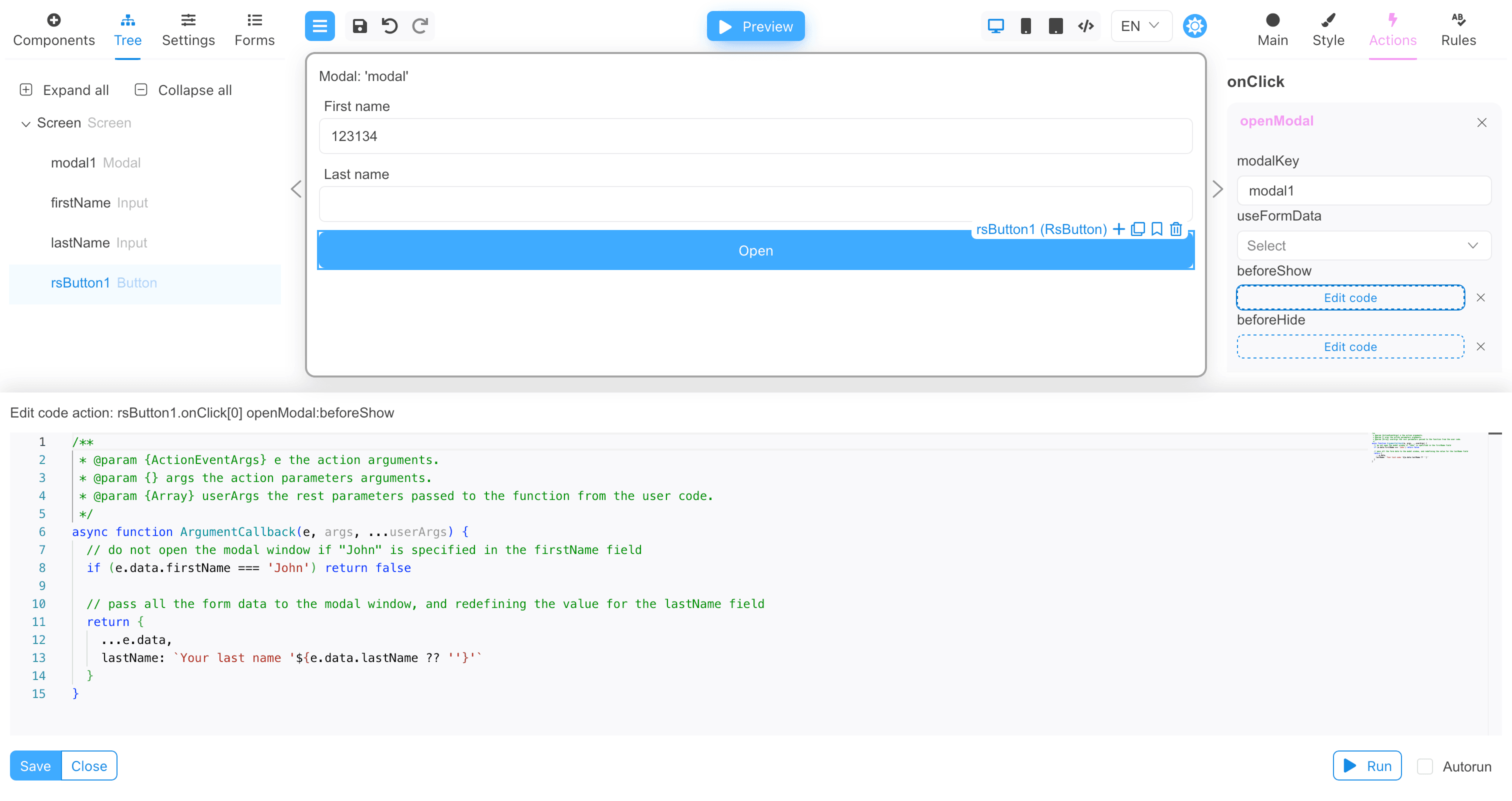
Now add the beforeShow function implementation:
/**
 * @param {ActionEventArgs} e the action arguments.
 * @param {} args the action parameters arguments.
 * @param {Array} userArgs the rest parameters passed to the function from the user code.
 */
async function ArgumentCallback(e, args, ...userArgs) {
  // do not open the modal window if "John" is specified in the firstName field
  if (e.data.firstName === 'John') return false

  // pass all the form data to the modal window, and redefining the value for the lastName field
  return {
    ...e.data,
    lastName: `Your last name '${e.data.lastName ?? ''}'`
  }
}
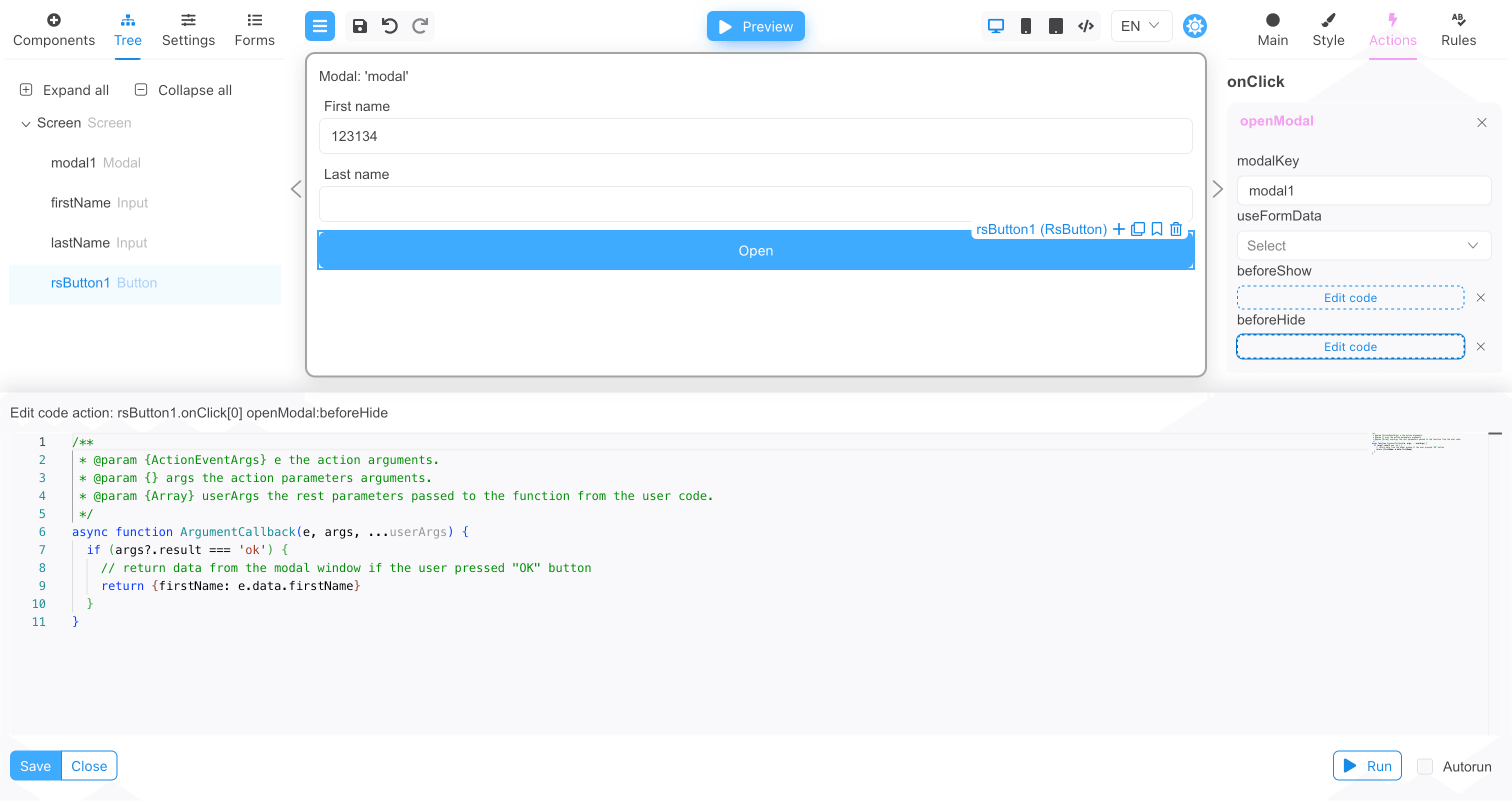
And for the beforeHide function implementation:
/**
 * @param {ActionEventArgs} e the action arguments.
 * @param {} args the action parameters arguments.
 * @param {Array} userArgs the rest parameters passed to the function from the user code.
 */
async function ArgumentCallback(e, args, ...userArgs) {
  if (args?.result === 'ok') {
    // return data from the modal window if the user pressed "OK" button
    return {firstName: e.data.firstName}
  }
}
Now we are ready to test the modal window. Below is the full JSON of the form.
Form's JSON
{
  "version": "1",
  "modalType": "RsModal",
  "form": {
    "key": "Screen",
    "type": "Screen",
    "props": {},
    "children": [
      {
        "key": "modal1",
        "type": "Modal",
        "props": {
          "modalTemplate": {
            "value": "Template:modal"
          }
        },
        "modal": {
          "props": {},
          "events": {}
        }
      },
      {
        "key": "firstName",
        "type": "RsInput",
        "props": {
          "label": {
            "value": "First name"
          }
        }
      },
      {
        "key": "lastName",
        "type": "RsInput",
        "props": {
          "label": {
            "value": "Last name"
          }
        }
      },
      {
        "key": "rsButton1",
        "type": "RsButton",
        "props": {
          "appearance": {
            "value": "primary"
          },
          "children": {
            "value": "Open"
          }
        },
        "events": {
          "onClick": [
            {
              "name": "openModal",
              "type": "common",
              "args": {
                "modalKey": "modal1",
                "beforeShow": {
                  "type": "fn",
                  "body": "  // do not open the modal window if \"John\" is specified in the firstName field\n  if (e.data.firstName === 'John') return false\n\n  // pass all the form data to the modal window, and redefining the value for the lastName field\n  return {\n    ...e.data,\n    lastName: `Your last name '${e.data.lastName ?? ''}'`\n  }"
                },
                "beforeHide": {
                  "type": "fn",
                  "body": "  if (args?.result === 'ok') {\n    // return data from the modal window if the user pressed \"OK\" button\n    return {firstName: e.data.firstName}\n  }"
                }
              }
            }
          ]
        }
      }
    ]
  },
  "localization": {},
  "languages": [
    {
      "code": "en",
      "dialect": "US",
      "name": "English",
      "description": "American English",
      "bidi": "ltr"
    }
  ],
  "defaultLanguage": "en-US"
}
Testing the modal window
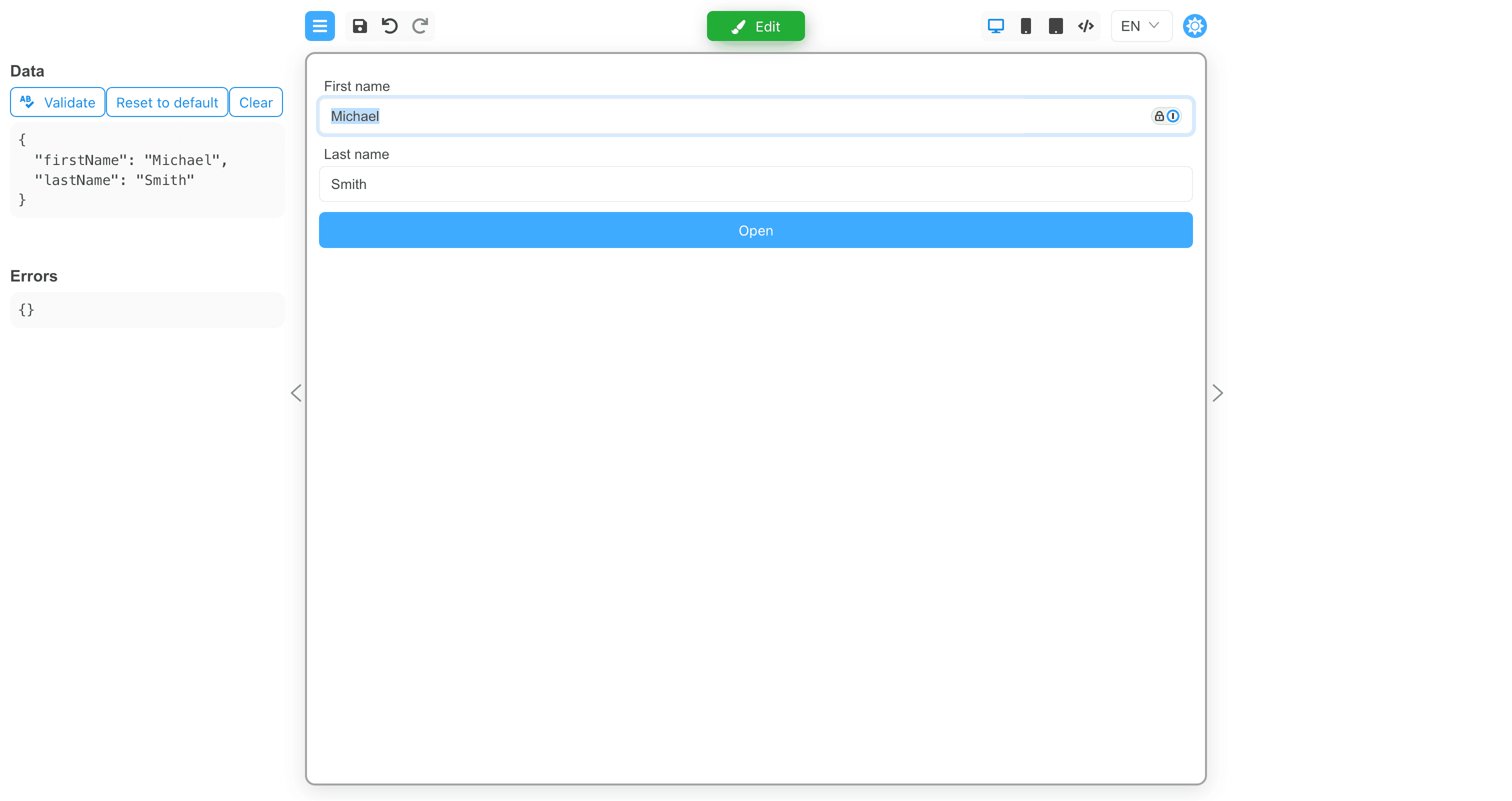
Click the Preview button, then type "John" in the First name field and "Smith" in the Last name field.
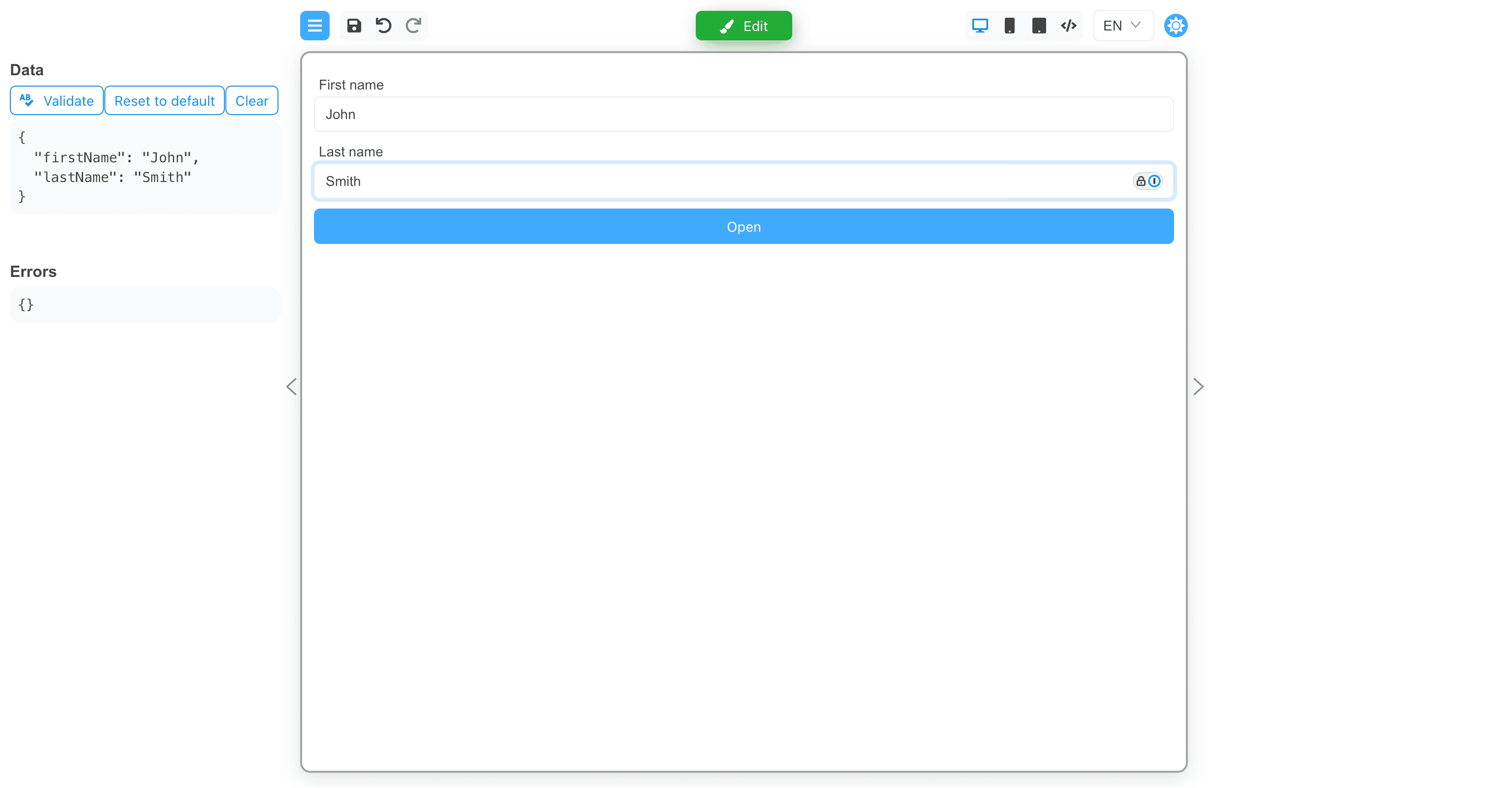
Now, if you click the Open button, the modal window will not appear because the First name field says "John".
Change the value of the First name field to "James".
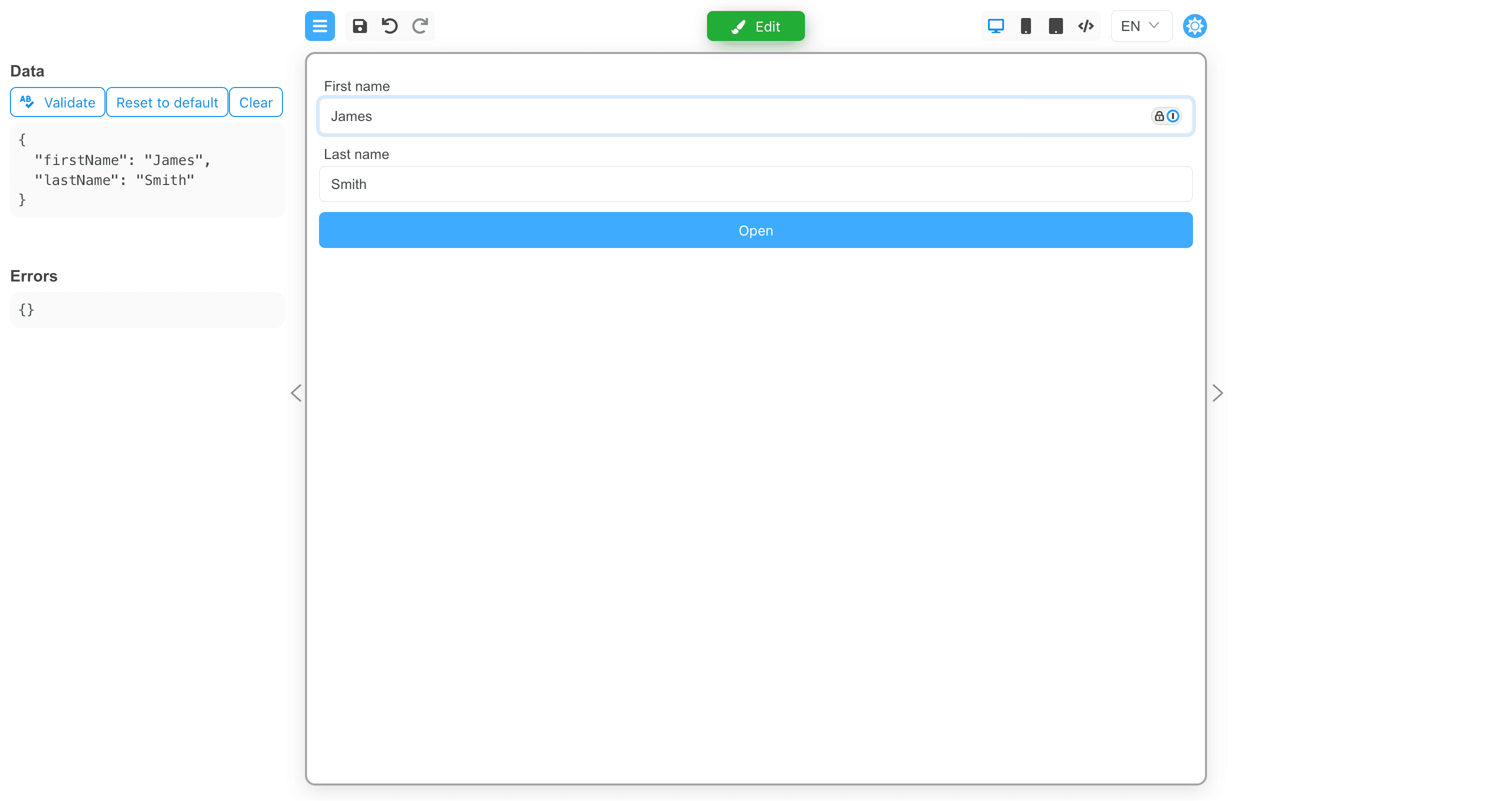
And click the Open button.
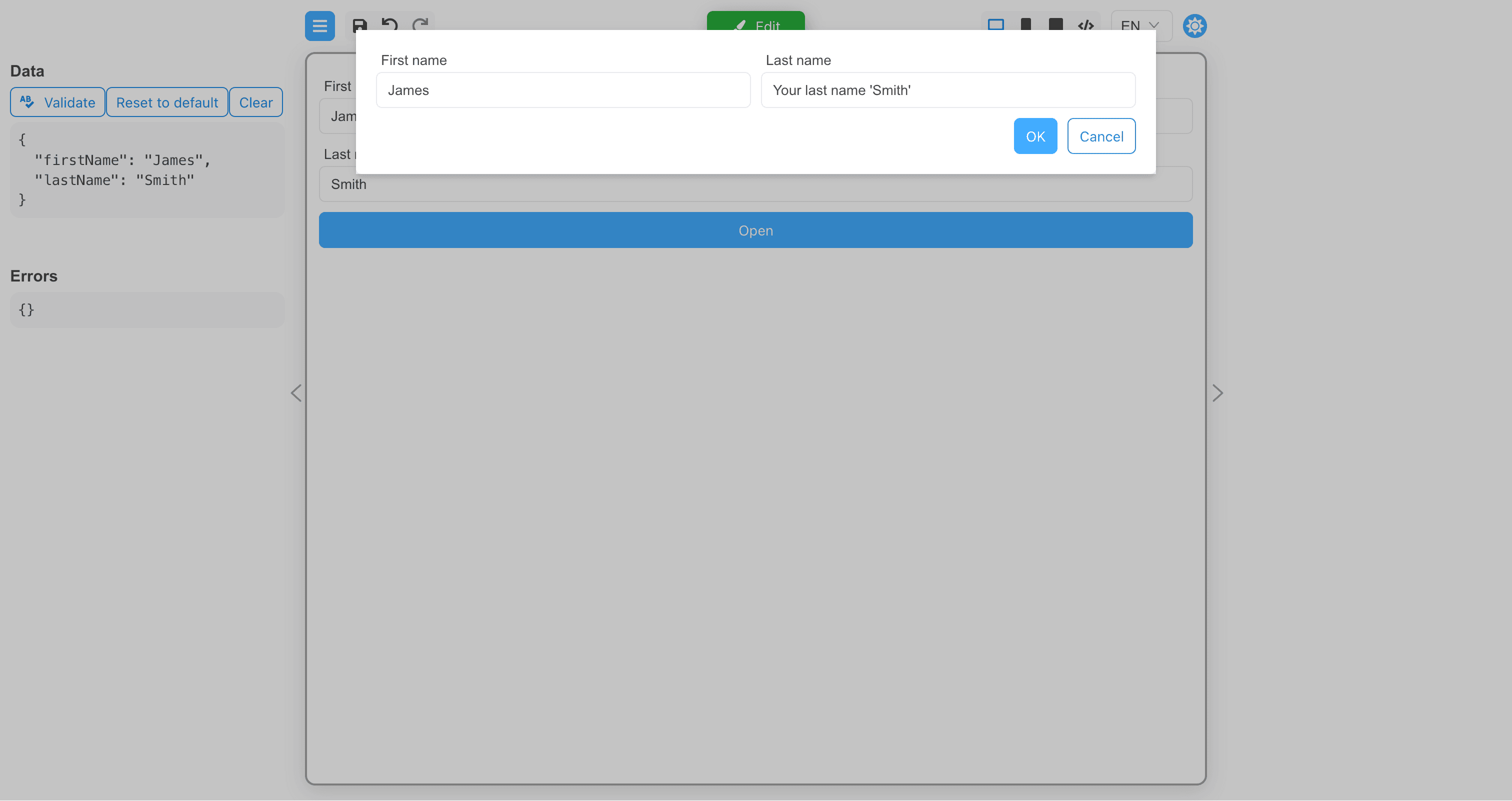
The modal window has been displayed and the transmitted data is visible in it. If you click the Cancel button, the modal window will
simply be closed and the data will not be transferred to the parent form. If you click the OK button, the data of the firstName field
will be transferred to the parent form, and the data of the lastName field will be ignored.
Change the values of the input fields and click the OK button.
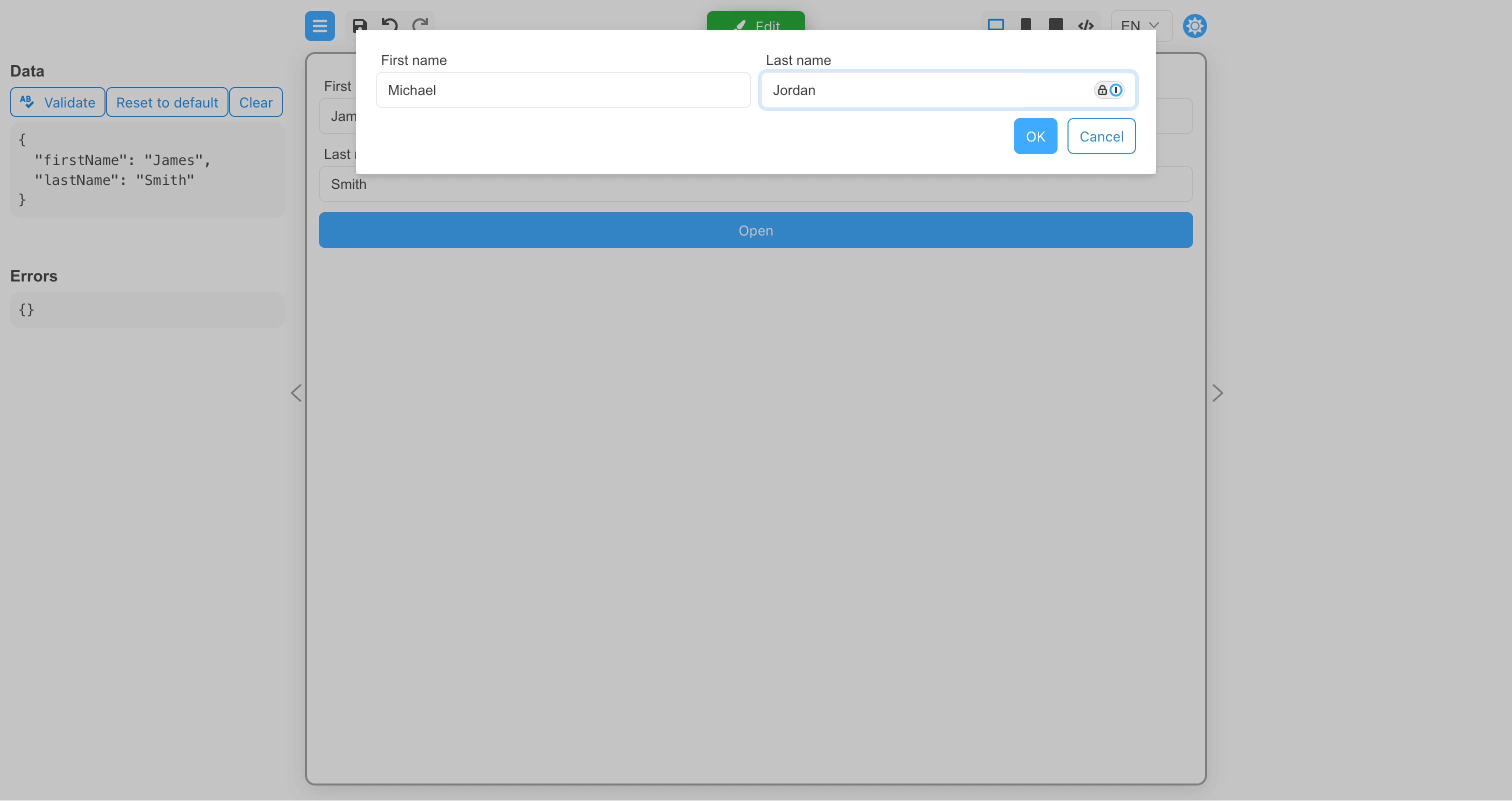
The modal window has closed, and data from the modal window has been transferred to the parent form.
Custom modal components
A custom modal component have to implement the following properties:
interface CustomModalProps {
  /**
   * Flag if true, the modal window should be displayed, false otherwise.
   */
  open: boolean

  /**
   * The function that should be called when the modal window is closed.
   */
  handleClose: () => void
}
A custom modal component have to have the role of a "modal" component.
Example of a custom modal component:
import {boolean, define, event, oneOf, string} from '@react-form-builder/core'
import type {SyntheticEvent} from 'react'
import {useCallback} from 'react'
import type {ModalProps} from 'rsuite'
import {Modal} from 'rsuite'

interface RsModalProps extends ModalProps {
  handleClose?: () => void
}

const RsModal = (props: RsModalProps) => {
  const {children, handleClose, onClose, ...rest} = props

  const close = useCallback((e: SyntheticEvent) => {
    handleClose?.()
    onClose?.(e)
  }, [handleClose, onClose])

  return <Modal {...rest} onClose={close}>
    {children}
  </Modal>
}

const modalSize = oneOf('xs', 'sm', 'md', 'lg', 'full')
  .labeled('Extra small', 'Small', 'Medium', 'Large', 'Full')
  .default('md')

export const rsModal = define(RsModal, 'RsModal')
  .name('RsModal')
  .props({
    autoFocus: boolean.default(true),
    backdrop: boolean.default(true),
    backdropClassName: string,
    classPrefix: string,
    dialogClassName: string,
    enforceFocus: boolean.default(true),
    keyboard: boolean.default(true),
    overflow: boolean.default(true),
    size: modalSize,
    onOpen: event,
    onClose: event,
  })
  .componentRole('modal')
  .hideFromComponentPalette()